Five 3-Room HDB Designs That Combines Beauty With The Illusion Of Space
Over the years, HDB flats of all sizes have been shrinking. If you look at the 3-room flats today, they are around 60 to 65 sqm on average. While 60 sqm of space isn’t the biggest, having a good interior designer can bring that Midas touch and turn your 3-room flat into a spacious and aesthetically pleasing space for you and your family.
Here are some examples of how five interior designers managed to turn 3-room HDB flats into spaces that combines beauty with the illusion of space.
1. Dots N Dots: Contemporary
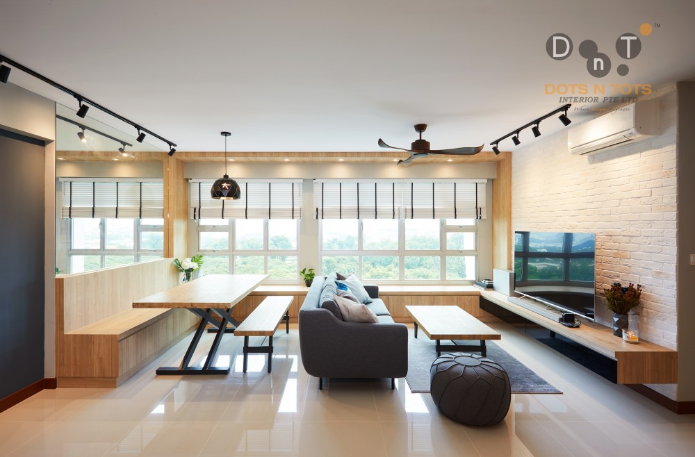

455B Ang Mo Kio ($35,000) by Dots ‘N’ Tots Interior Pte Ltd
To create an illusion of space and make your home appear visually bigger, one hack you can use is to make smart use of the lighting. That is exactly what the interior designer at Dots N Dots did for this 3-room HDB at Ang Mo Kio.
The good use of natural lighting illuminates the living room, making the 3-room HDB seem spacious and roomy. On top of that, it combines the natural lighting with light colours that not only makes the room bigger, but also complements the contemporary design that the homeowner was going for.
Another interior design touch in this 3-room HDB that adds to the spaciousness is the large mirror behind the dining table. Adding a mirror draws the focal point and gives an illusion of depth, making the room look larger than in reality.
2. MS Studios: Minimalist
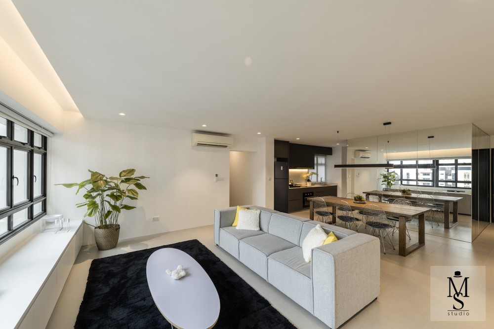

Minimalist ($102,000) by Mr Shopper Studio
If you want to grow the size of your room, try going for monochromatic themes or minimalist design. Having few colours around the home makes it easy for the eyes to move around the room without getting interrupted by visual stimuli like bright colours. It also helps when you go for a minimalist look that doesn’t involve much furniture to make the living room look cluttered.
Just like the previous 3-room home in Ang Mo Kio, this 3-room HDB designed by MS Studios also makes use of mirrored walls and natural lighting to create a sense of spaciousness in the home. In addition, the interior designer chose to go with an open kitchen rather than a closed kitchen, which removes the walls to make the 3-room flat feel wider.
3. Carpenters: Scandinavian
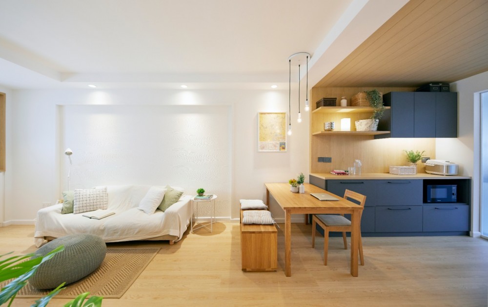

306 Clementi ($40,000) by Carpenters 匠
The easiest way to create the illusion of space is to avoid having large, cumbersome furniture in your home. It is exactly how the saying goes: Less is more and more is less. So, what better way to go for the clean, minimalistic, and clutter-free look than the Scandinavian theme?
This 3-room flat designed by Carpenters pulls off the perfect Scandinavian look to combine beauty with the illusion of space. The use of light colours gives the room a perception of depth. Yet, it doesn’t seem all that boring because there are also shades of blue at the corner.
Given how spacious the space feels, you will be forgiven If you thought that this a 4-room flat rather than a 3-room.
4. Space Change: Industrial
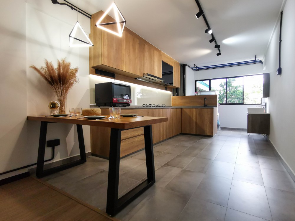

Bedok North – HDB ($27,000) by Space Change
Minimalist design might sound like the go-to theme if you are looking for a clutter-free and spacious look, but that doesn’t mean that other interior design themes can’t give you the same effect. It really depends on the interior designer that you are working with and how he/she can elevate your living space with their skill. In fact, you can still make your home look and feel spacious even with an industrial interior design style.
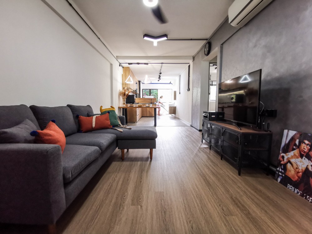

Bedok North – HDB ($27,000) by Space Change
In this 3-room resale flat at Bedok North which spots the older elongated layout, the interior designer at Space Change marvellously transforms it into a spacious living space. The walls between the kitchen and the living room was removed to extend the living room into the kitchen as one common space. This makes the living space feel much bigger.
You can see that the space is designed to optimize the living area while still having enough industrial elements to give it the industrial look that the homeowner was going for.
5. Divine & Glitz Design: Scandinavian
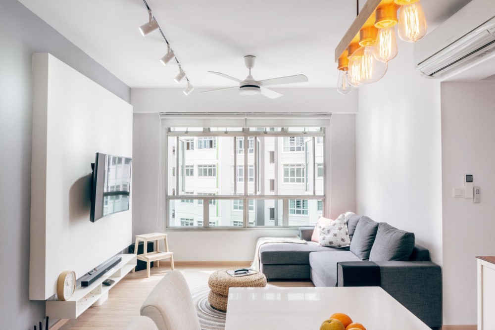

Yishun Bto ($42,000) by Divine & Glitz Design
The lack of space is a real challenge for many new homeowners, especially for those who are buying a new Build-To-Order (BTO). Although there’s hardly much you can do about the space (unless you upgrade), what you can do is to get yourself a good interior designer that can work magic with the limited space given to him/her.
Just look at how the interior designer at Divine & Glitz Design managed to turn this 50 sqm BTO in Yishun into a liveable and cosy home.
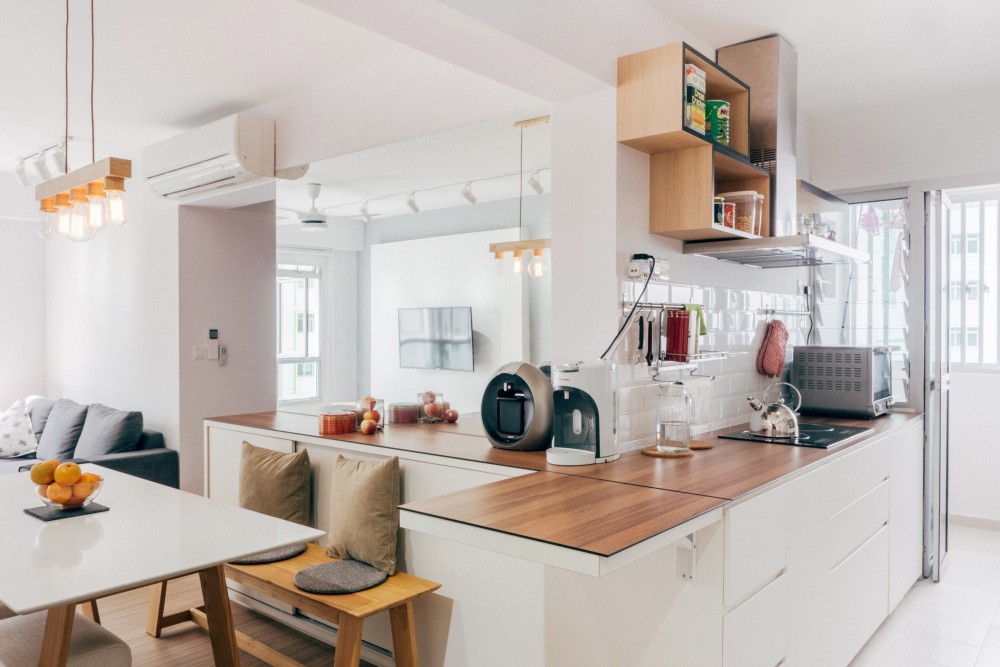

Yishun Bto ($42,000) by Divine & Glitz Design
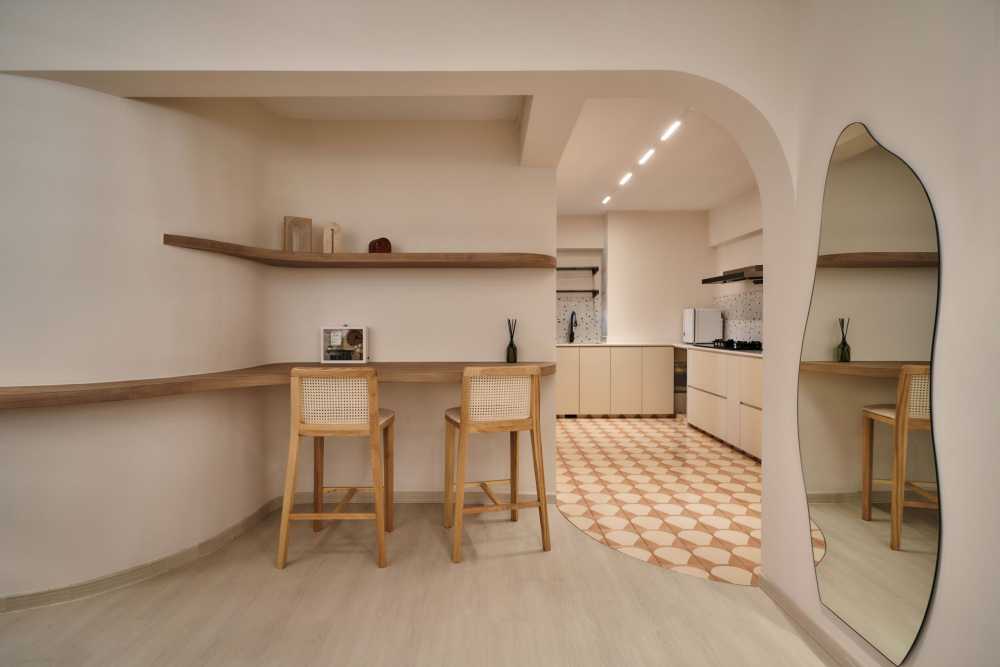
By removing the walls to the kitchen, the walkway between the living/dining area to the kitchen becomes more vast. There’s even extra space to add storage just behind the dining bench. The interior designer also complemented the design with a large mirror on the wall behind the dining bench to add a perception of depth to the 3-room flat.
Browse For More Interior Design For 3-Room HDBs On Hometrust
Starting to fall in love with some of the interior design that you see for 3-room HDB flats, but would love to explore more designs?
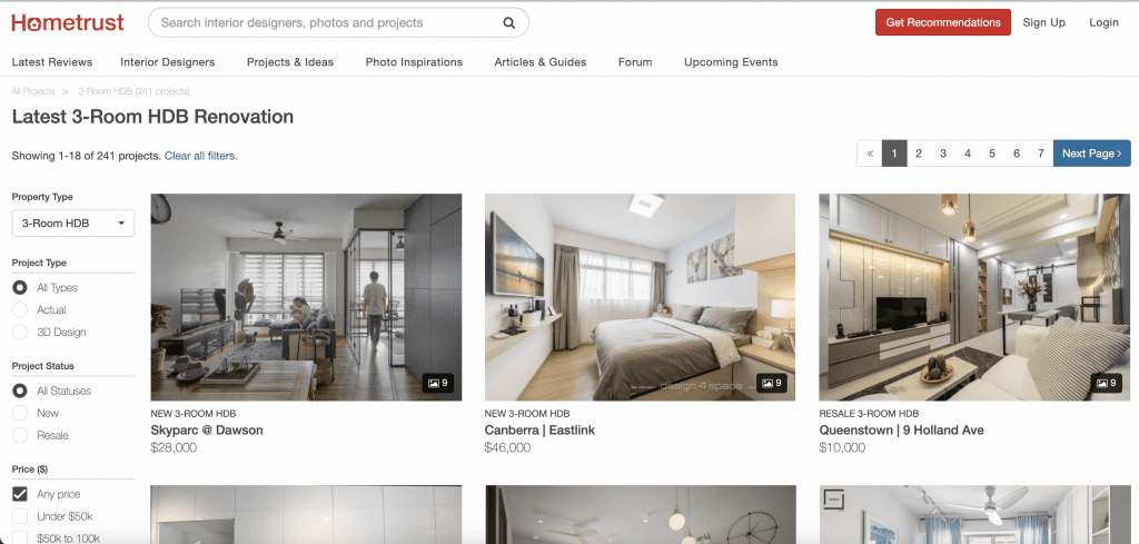

At Hometrust, we curate interior design portfolios from our interior design partners. You can browse through various renovation projects on Hometrust to find one that fits your liking. We even added the function for you to filter by budget, floor area, and style.
Renovating soon? Speak to top rated interior designers.
Discuss your home renovation ideas and plans with top rated firms, recommended by past homeowners. Let us help you shortlist the most suitable interior designers for your project.

